
We wanted to do a small exercise in representing territorial data differently to see how different conclusions could be drawn from each of them.
With the current situation in Covid, we receive multiple mapping and statistics. In this post we want to take advantage of how different the reality that can be removed from the representation of the data can be.
Firstly, we have drawn up a table with the variation in the percentage of the declared COVID-19 cases of the major Spanish Autonomous Communities as well as the global of the whole state.
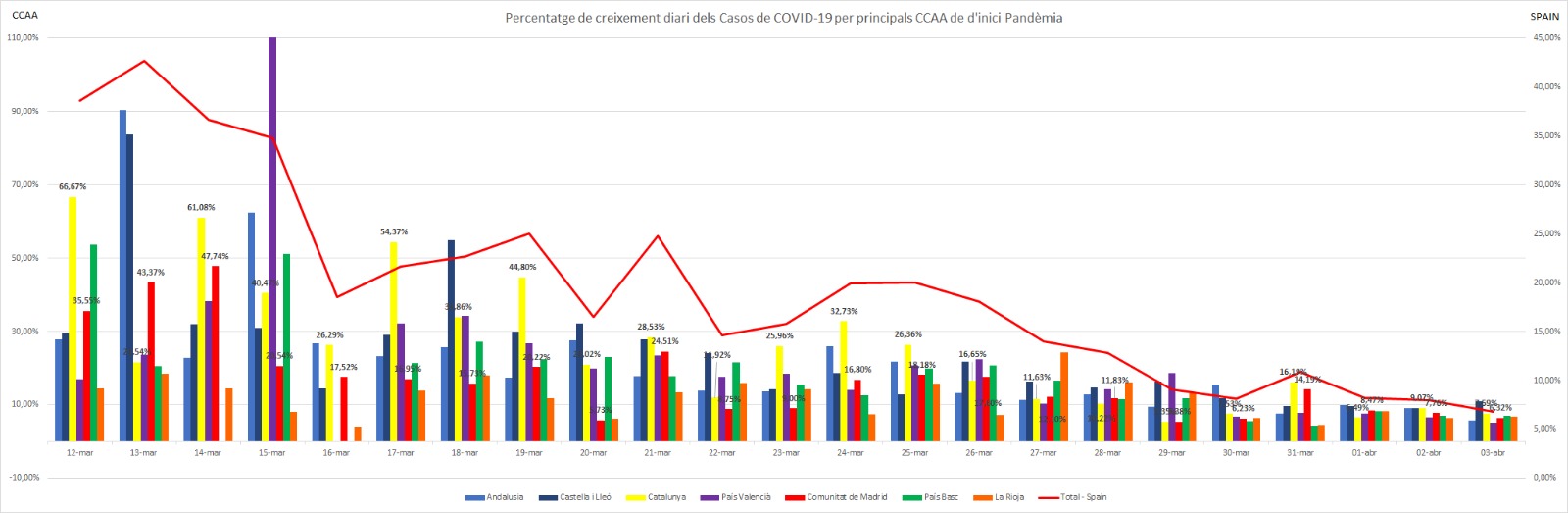
From the analysis of this graph, it can be deduced that the situation is getting better and better since the daily increase in new cases is beginning to be below 7% in the major Autonomous Communities and the whole state. In the early days of the pandemic, values had increments well above 70, 90 and even 100% in some territories. We must bear in mind that we are talking about percentage and therefore relative values.
In the following chart, we wanted to represent the absolute daily cases that are occurring in the same communities and in the overall area./b>
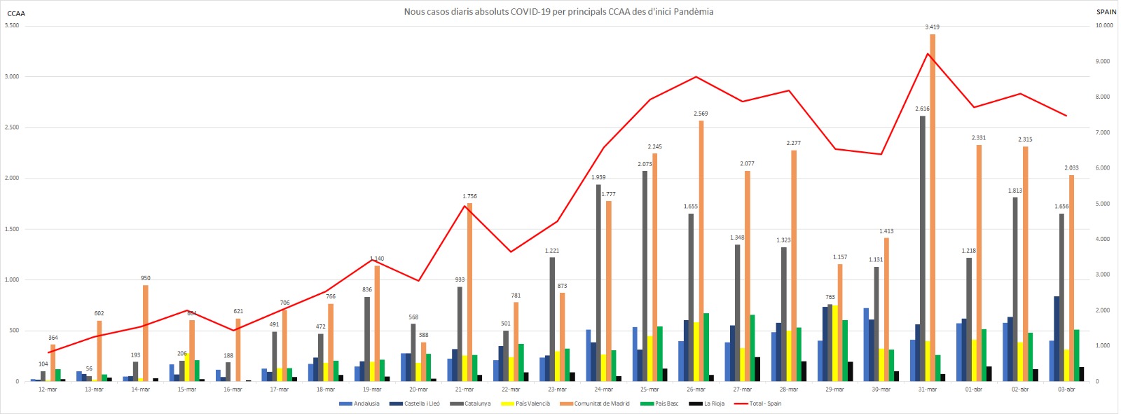
On the left axis we find the absolute growth values for the various Autonomous Communities represented, and on the right axis we have the values for the whole territory.
With the analysis of this table, it would seem that it is a little less optimistic at the moment, as the daily increases in new cases are still quite significant. However, if it can be deduced that the situation is beginning to stabilise.
Finally, we have represented on a map with permanent update the data published by the Centro de Coordination de Alertas y Emergencias Sanitarias of all the Autonomous Communities, both in terms of confirmed cases in general, for every 100,000 inhabitants, the number of deaths, the number of hospitalized persons and the number of incoming UCI.
….


